The past eighteenth months have arguably been the strangest footballing times ever. This summer’s EUROs tournament seems to be the light at the end of the tunnel.
Of course, EURO 2021 (or 2020, whatever you want to call it) will not be a ‘normal’ tournament. Crowds will be limited and mask wearing will be widespread. Certain countries have been barred from holding matches due to the pandemic.
Wembley Stadium, ‘The Home of Football’, will host several games including the final. It will be emblazoned with UEFA’s chosen branding scheme for the tournament – one which teaches a valuable lesson about brand purpose.
 1")
The COVID-19 Pandemic has stripped not only football fans but people generally of the one thing that all humans need to survive – other people. Both subconsciously and consciously, humans need interaction for mental and physical wellbeing. Even the most reclusive people, deep down, will want to socialise even if they don’t feel like it. Why? Because it’s normal human nature.
Consequently, relationships suffered. People began to feel lonely and disconnected from each other. Sport – especially football – brings people together and gives them a sense of belonging. So, when the relief and interaction that the sport can bring was taken away by the pandemic, bridges were burned. Fan-club relationships suffered, and arguably, football soured as a result.
Controversies such as the Super League scandal and the implementation of VAR has perhaps caused even more of a divide between supporters and football as an institution. This is something that UEFA have tried to address in their branding for EURO 2021.
Clear brand purpose is essential in establishing any creative venture. Design agency VMLY&R have skilfully portrayed UEFA’s intent for this summer’s tournament.
YMLY&R and UEFA have focused on the idea of ‘bridging’. UEFA are clearly aiming to reconnect with fans – both physically and metaphorically – through the EUROs. After the turbulent 18 months that both football and the world generally have suffered, it’s vital that UEFA portrayed the idea of unity. They had to emphasise that football was there to heal division and bring people back together.
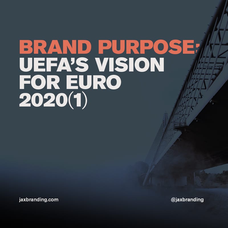
YMLY&R used literal bridges in their design for various aspects of the tournament’s branding to help UEFA’s brand purpose shine through. The logo itself incorporates the iconic Henri Delaunay trophy standing in front of several cheering figures – most importantly, side by side.
 2")
On billboards, adverts, and other visual entities dotted around the world both online and in practice, the bridge continued. It is connected by roads – roads that don’t break – and brings the eleven host cities together in a way that is both aesthetically unique but implicitly powerful.
Brand purpose is something that can be difficult to define. UEFA and YMLY&R have drawn on the zeitgeist of the present day (atmosphere of the time) to subconsciously link to the way the world is. Slowly but surely, coming back together. It’s an ode to some sort of normalcy – but a normalcy that we perhaps didn’t realise we needed.
UEFA’s brand purpose is clear: to bring people back together through football.
Being clear in their brand purpose is one thing, but UEFA have also considered the need for a unified brand identity across their campaign.
Connection and unity are portrayed physically and metaphorically in the branding for EURO 2021. In terms of the practical design itself, however, it’s important to talk about why their branding is useful for the way it will be consumed.
Simply put, much of the ‘consumption’ of the branding for the EUROs will occur online. This year more than ever, social media will play a huge role in the EUROs, simply because fewer spectators will be attending in person. This is purposeful in two ways.
 3")
Firstly, social media is often a place of division and hate. Whilst it can be a force for good, it too regularly isn’t. UEFA’s message of togetherness is important in this sense. Although likely unintentional, the idea of creating bonds and relationships in sport is something that is particularly apt at the present time – a time when players, clubs and fans are often so far apart.
Secondly, things often get lost on the internet. This means that a consistent brand identity underpinned by a clear brand purpose is vital when promoting on social media. The branding work that YMLY&R do is visually striking and stands out which is immediately a huge positive. The actual design itself is impressive. But, perhaps more importantly, a consistent identity doesn’t get lost.
It’s easy to go missing when creating a brand, and it’s not something that you want to suffer the consequences of. Keep your tactics tight, and contact JaxBranding today.
Want to kick off your business career? Chat with Jack about your vision, and get the ball rolling.