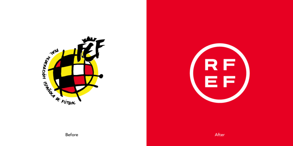
The Spanish Football Federation has recently released their new logo. But it’s safe to say that the symbol hasn’t been received well.
Football logo design is an art. In fact, logo design in business is something that should always be taken seriously and done by a professional. But, in terms of the beautiful game specifically, new logos or club/organisation rebrands don’t always go down well with fans. The latest footballing body to deal with this fallout is the Spanish Football Federation – the Real Federación Española de Fútbol or RFEF for short.
Only a few days ago, RFEF decided to revitalise the face of their brand. They brought in a new logo, aiming to freshen up the face of Spanish football. But why has their decision been met with disappointment? Well, because football is composed of two things that often don’t go together: emotions and business.

Before we discuss that pitfall, however, it’s important to look at the logo RFEF replaced. Spain is a nation with a rich cultural heritage. A sense of flamboyance and flair underpin Spanish culture, and this is no different in the sporting context. The Spanish national football team has been renowned for the silky passing game that served the nation so well in the early to mid-2000s.
RFEF’s previous logo encapsulated this sentiment.
A striking multicoloured chequered pattern on a bold yellow background with a handwritten typeface was different and most certainly distinctive. The design was extracted from a work by Joan Miró, the famous Spanish painter, sculptor and ceramicist, and draws similarities to the work of artist Gaudi in its style. The crest also drew on subconsciously Spanish ideas – the sun kissed golden beaches and the red and yellow of the national flag.
Football logo design should be unique, as every team has a different story to tell. Arguably, this is where the new RFEF logo is problematic.
There’s a growing trend in world football in respect to branding and logos. Teams with rich histories are rebranding for, often, no identifiable purpose. Rather, the powers that be decide that ‘it’s time to modernise’. However, this isn’t always for the better.
Fans become attached to certain images due to the memories that they carry. Much like when Leeds United changed their badge in 2018, any sort of emotional weighting was simply obliterated, with a generic, ‘stock image’ type look virtually wiping out over one hundred years of history.
If you didn’t know what the ‘Real Federación Española de Fútbol’ was, would you know that this logo was related to football at all? Let’s put it to the test. If you were to use this logo on the packaging of a sport cooling gel, would you be able to tell that it belongs to the Spanish national team?

You can get the impression that the decision to launch the new logo was made behind closed doors. The new symbol has been scalped of everything the Spanish footballing world stood for the sake of simplification. Similarly, the new design doesn’t really make sense. For example, the crest’s lettering doesn’t make it clear in which order the letters actually go. The logo could be read as ‘RFEF’ or ‘REFF’. Similarly, the badge doesn’t scream ‘Spain’ or ‘football’. For those who don’t follow the beautiful game, the new RFEF football logo design may as well represent a media firm or tech company.
The new logo is devoid of all heritage.
The old crest symbolised everything that the Spaniards stood (and still stand) for: passion, creativity, spontaneity, energy, dynamism and originality. The old symbol may not have been as functional when it came to using it in various formats, but it did have one irreplaceable aspect. It was emotionally anchored to the best times in Spain’s footballing history – winning the Euros, the World Cup and playing attractive football.
How simplistic is too simplistic?
When discussing the new RFEF logo, the organisation’s president Luis Rubiales said ‘we want a powerful image that I hope will accompany us in future successes. Our brand had to move forward, with elegance and simplicity, but with power’. Simplicity has been achieved, quite evidently, but is the logo powerful or elegant?
People often forget that, in modernisation, there is a place for tradition. Tradition makes us who we are, but in the case of the new RFEF logo, meaning has been lost. When you think about a logo you need to think about the entire identity system. Above all, however, any rebranding must begin with who it is to serve.
You get the impression that the decision to launch the new logomark was made behind closed doors. The new symbol has been scalped of everything the Spanish footballing world stood for the sake of simplification.
People like simple things – it’s a fact. The new symbol is flexible enough to work in any form of presentation. But we should remember that in addition to simplicity, message and individuality are also important. Is the new RFEF football logo design really recognisable?
When it comes to branding, minimalism isn’t always the best option. For professional advice, get in touch with JAX Branding today.
Want to kick off your business career? Chat with Jack about your vision, and get the ball rolling.


